
Hello! Hello! It has been a while since my last post. This one is a continuation from Part 1. So, let’s continue.
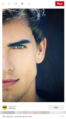
After painting the dragon to about 90% completeness, I decided to work on Vert in his human form. I’ve been seeing Vert inside my head for a while now; however, I’m not such a genius that I can pain realistic looking humans without a reference (this is what I aspire to). Fortunately, I was able to find a model on Pinterest that looked so much like Vert, that I found the experience creepy.


The only difference is that he did not have Vert’s green eyes. However, another model provided those.
When drawing humans, I often take pictures of myself in a pose I require to help me out with anatomy. However, this time, I found a truly great image by SenshiStock on DeviantArt.

As you can see I’ve adjusted the pose to fit my needs.
Just as when I was painting the dragon, the first step was to paint (or block in) the basic colors, shadow, and light.

In the subsequent steps, I’ve continued to add details and refine the shape of Vert in his human form. I’m always thinking about the form and the direction of the light source. What is the focus of the image? The focus should always be sharper and more contrasted than the rest of the image. Sometimes I go back and lose some of the edges, allowing them to blur with the background. I always work from larger forms towards details, never the other way around. Painting digitally, I have the luxury of keeping separate layers. Therefore, I can make quick changes to parts of the painting, or I can paint over the painting on another layer. This way, if I do not like the changes I made, I can always delete the layer. Painting digitally, I do not have to worry about experimenting. This is very different from a watercolor painting, which I always must pre-plan.


The last step was to add light, shadow, and in this case magic.
Nathan Fowkes showed me how to paint light. It involves creating a group of layers to simulate light.

The first step is to create a color layer by clicking on the half black/half white circle symbol at the bottom of the Layers Palette then choosing Solid Color. Pick the color you wish your light to be. In my case I chose a bright greenish-yellow color. Since Light is translucent, I changed the opacity of this new color layer to 18%.
Next, I used the Adjustments Palette (Window > Adjustments) and modified my Color Layer until it felt like light. It is important to use the Adjustments Palette, because unlike selecting modifications from the top menu, the Adjustments Palette creates new layers that modify the image, without affecting the painted image.
As you can see with the image above, I’ve played with Color Balance, Levels, Hue/Saturation, and another Color Balance layer until I was happy with the adjustments made to my Color Layer. Then I selected these layers and added them to a Group (folder). I renamed this folder as Light.
I dragged the folder to the rectangle with the white circle symbol found at the bottom of the Layers Palette. This created a Layer Mask for the folder. I clicked Ctrl + i and inverted the mask. I clicked on the image icon next to the folder.
I chose a soft round brush, and by selecting pure white, I began to pain in the light. Choosing pure black allowed me to pain out the light. I kept adjusting the Opacity and Flow of the brush (found under the top menu when the Brush Tool is selected), with Pen Sensitivity turned on, until I was happy with the results.
After painting in the light, I repeated the process and painted in the shadows.
For the shadows, I chose a contrasting color, a dark purple-red. Using a contrasting color when painting shadows makes the painting appear more vibrant then by simply choosing black or brown.
The last step to this stage was to paint in sparkling stars. I used my own star stamp brush I created earlier.

At this point, I felt the image was 99% complete. I took a couple of days off from painting so that I could see it with fresh eyes.
The last thing I did was to adjust the Levels and the Vibrancy of the entire painting. I also darkened the dragon’s eye. Then I added the title, and cropped the image to the appropriate cover size.
This cover is ready to be published.


If you would like to see the Time Lapse videos of the entire process, click here.
If there are a few videos missing, that’s because I have not had the time to render and upload the last few videos yet. Check back in a few days.
Thank you for reading through my painting process. If you have any questions, ask them in the comments, or feel free to contact me privately via the Contact Form on the Right, or through Social Media.
Bye-Bye for now!
M
P.S. FYI The painting took about 15 hours (not counting research and sketching). I would charge $600 just for the painting stage. For the entire artwork, it would cost between $800 to $1000. This is why I recommend that if you are looking to hire an artist, you do all the research and have a clear vision of what it is that you want, before you approach the artist. Just as you would not want to work for free, please do not ask the artist to work for free.
You can find out more about Mili Fay Art commissions here.


No comments:
Post a Comment
Please be polite and courteous. Spam will not be published.